


User Experience (UX) design is a multifaceted discipline that focuses on enhancing user satisfaction by improving the usability, accessibility, and pleasure provided in the interaction between the user and the product. At its core, UX design is about understanding the needs and behaviors of users, which requires a deep dive into user research methodologies. Techniques such as surveys, interviews, and usability testing are employed to gather insights into how users interact with a product.
This data informs design decisions, ensuring that the final product aligns with user expectations and enhances their overall experience. Moreover, UX design is not limited to the visual aspects of a product; it encompasses the entire journey a user takes when interacting with a service or application. This journey can be broken down into various stages, including awareness, consideration, and decision-making.
Each stage presents unique challenges and opportunities for designers to create meaningful interactions. For instance, during the awareness stage, a user may encounter a website through search engines or social media. The design must capture their attention and provide clear pathways to explore further.
By understanding these stages, designers can craft experiences that resonate with users and foster engagement.
Key Takeaways
- UX design focuses on creating a positive and seamless experience for users when interacting with a website or application.
- Choosing the right frontend technologies is crucial for creating a responsive and efficient user interface.
- Implementing responsive design is essential for ensuring mobile compatibility and providing a consistent experience across different devices.
- Optimizing website performance and loading speed is important for retaining user engagement and satisfaction.
- Incorporating intuitive navigation and UI design enhances user experience and makes it easier for users to interact with the website or application.
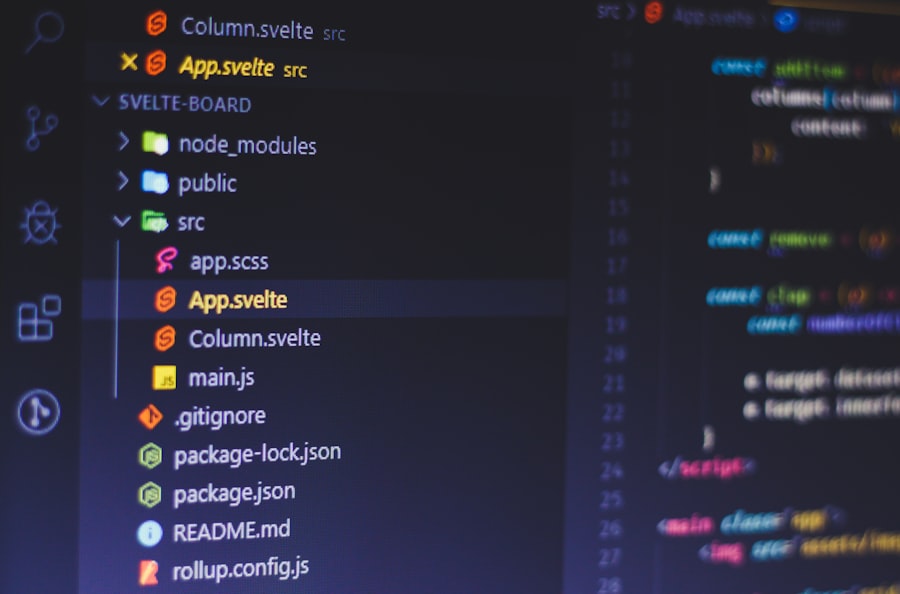
Choosing the Right Frontend Technologies
Selecting the appropriate frontend technologies is crucial for building a robust and efficient web application. The frontend is the part of the application that users interact with directly, making it essential to choose technologies that not only enhance performance but also facilitate a seamless user experience. Popular frameworks such as React, Angular, and Vue.js have gained traction due to their ability to create dynamic and responsive interfaces.
Each of these frameworks has its strengths; for example, React is known for its component-based architecture, which allows for reusable UI components, while Angular offers a comprehensive solution with built-in features like dependency injection and routing. In addition to frameworks, developers must also consider the underlying languages and tools that will support their frontend development. HTML, CSS, and JavaScript are foundational technologies that form the backbone of web development.
CSS preprocessors like SASS or LESS can streamline styling processes by allowing developers to use variables and nested rules, enhancing maintainability. Furthermore, tools like Webpack or Parcel can optimize asset management and improve loading times by bundling resources efficiently. The choice of technologies should align with the project’s goals, team expertise, and long-term maintainability.
Implementing Responsive Design for Mobile Compatibility
In an era where mobile devices account for a significant portion of web traffic, implementing responsive design has become imperative for any web application. Responsive design ensures that a website adapts seamlessly to various screen sizes and orientations, providing an optimal viewing experience across devices. This approach involves using flexible grid layouts, fluid images, and media queries to adjust content dynamically based on the user’s device.
For instance, a website designed with responsive principles will rearrange its layout on a smartphone compared to a desktop, ensuring that text remains legible and navigation remains intuitive. The importance of responsive design extends beyond aesthetics; it also impacts search engine optimization (SEO) and user retention. Google prioritizes mobile-friendly websites in its search results, meaning that a non-responsive site could hinder visibility and traffic.
Additionally, users are more likely to abandon sites that do not perform well on their devices. By employing techniques such as mobile-first design—where designers start with the smallest screen size and progressively enhance the experience for larger screens—developers can create websites that not only look good but also function effectively across all platforms.
Optimizing Website Performance and Loading Speed
| Metrics | Value |
|---|---|
| Page Load Time | 2.5 seconds |
| Page Size | 800 KB |
| Number of Requests | 25 |
| First Contentful Paint | 1.2 seconds |
Website performance is a critical factor that influences user experience and engagement. A slow-loading website can lead to high bounce rates and decreased user satisfaction. To optimize performance, developers must focus on several key areas, including image optimization, code minification, and efficient server responses.
For example, using image formats like WebP can significantly reduce file sizes without compromising quality, leading to faster load times. Additionally, employing lazy loading techniques allows images and other resources to load only when they are in the viewport, further enhancing performance. Another essential aspect of performance optimization is minimizing HTTP requests.
Each request made by a browser to load resources adds to the overall loading time. Developers can mitigate this by combining CSS and JavaScript files into single files or using content delivery networks (CDNs) to cache resources closer to users geographically. Furthermore, leveraging browser caching can allow returning visitors to load pages faster by storing static resources locally on their devices.
By implementing these strategies, developers can create websites that not only perform well but also provide a smooth experience for users.
Incorporating Intuitive Navigation and User Interface (UI) Design
Intuitive navigation is a cornerstone of effective UI design, guiding users through a website in a way that feels natural and effortless. A well-structured navigation system allows users to find information quickly without feeling overwhelmed or confused. Common practices include using clear labels for menu items, organizing content hierarchically, and providing breadcrumbs for easy backtracking.
For instance, an e-commerce site might categorize products into distinct sections such as “Men,” “Women,” “Kids,” and “Sale,” making it easy for users to locate what they are looking for. In addition to navigation structure, visual elements play a significant role in UI design. Consistency in color schemes, typography, and button styles helps create a cohesive experience that reinforces brand identity.
Designers often utilize whitespace strategically to separate elements and improve readability. Furthermore, incorporating interactive elements such as hover effects or animations can enhance engagement without overwhelming users. By focusing on both navigation and visual design principles, developers can create interfaces that not only look appealing but also facilitate user interactions effectively.
Integrating Accessibility Features for All Users

Accessibility in web design ensures that all users, including those with disabilities, can access and interact with digital content effectively. This involves adhering to established guidelines such as the Web Content Accessibility Guidelines (WCAG), which provide a framework for creating inclusive web experiences. Key considerations include providing alternative text for images, ensuring sufficient color contrast between text and backgrounds, and enabling keyboard navigation for users who cannot use a mouse.
For example, screen readers rely on properly structured HTML elements to convey information accurately to visually impaired users. Moreover, accessibility should be integrated into the design process from the outset rather than being treated as an afterthought. Conducting accessibility audits during development can help identify potential barriers early on.
Tools like WAVE or Axe can assist in evaluating compliance with accessibility standards by highlighting issues that need addressing. By prioritizing accessibility features, developers not only comply with legal requirements but also expand their audience reach and enhance overall user satisfaction.
Utilizing Best Practices for SEO and Content Optimization
Search Engine Optimization (SEO) is essential for increasing visibility in search engine results pages (SERPs) and driving organic traffic to websites. Implementing best practices involves optimizing both on-page elements—such as title tags, meta descriptions, header tags—and off-page factors like backlinks from reputable sources. For instance, crafting compelling title tags that include relevant keywords can significantly improve click-through rates while ensuring that content remains engaging and informative.
Content optimization goes hand-in-hand with SEO efforts; high-quality content that addresses user intent is more likely to rank well in search engines. This includes using relevant keywords naturally throughout the text while avoiding keyword stuffing—a practice that can lead to penalties from search engines. Additionally, structuring content with headings and subheadings improves readability and helps search engines understand the hierarchy of information presented on the page.
By focusing on both SEO best practices and content quality, developers can create websites that attract visitors while providing valuable information.
Testing and Iterating for Continuous Improvement
The process of testing and iterating is vital for refining web applications post-launch. User feedback plays an essential role in identifying areas for improvement; methods such as A/B testing allow developers to compare different versions of a webpage to determine which performs better in terms of user engagement or conversion rates. For example, changing the color of a call-to-action button or adjusting the placement of key information can yield significant differences in user behavior.
Additionally, analytics tools provide valuable insights into how users interact with a website over time. Metrics such as bounce rates, session duration, and conversion rates help identify patterns that inform future design decisions.
By fostering a culture of testing and iteration within development teams, organizations can ensure their web applications remain relevant and effective in meeting user needs over time.
If you’re interested in exploring the evolution of frontend development, you might find it intriguing to consider the historical context of mathematical advancements that have indirectly influenced modern technology. An article that delves into the mathematical innovations of the Renaissance and the seventeenth century, such as those by Descartes and Fermat, can provide valuable insights into the foundational principles that underpin computational logic and design. For a deeper understanding, you can read more about these historical developments in the article titled “Algebra, Trigonometry, and Arithmetic in the Renaissance: Analytic Geometry in the Seventeenth Century – Descartes & Fermat” by visiting this link.


+ There are no comments
Add yours