


In the realm of web design, buttons serve as critical interactive elements that facilitate user engagement and navigation. They are not merely functional components; they are also visual cues that guide users through a website or application. The design of buttons can significantly influence user experience, as well as the overall aesthetic of a digital interface.
This article delves into the intricacies of button design using these technologies, exploring various aspects from basic construction to advanced styling techniques. The importance of button design cannot be overstated.
A well-designed button can enhance usability, encourage user interaction, and ultimately lead to higher conversion rates. Conversely, poorly designed buttons can confuse users, leading to frustration and abandonment of tasks. As such, understanding how to effectively utilize HTML and CSS for button design is essential for any web developer or designer.
This article will provide a comprehensive overview of the principles and practices involved in creating effective buttons, ensuring that they are both aesthetically pleasing and functionally robust.
Key Takeaways
- Understanding the basics of HTML and CSS is essential for button design
- Choosing the right button styles and shapes can enhance user experience
- Adding hover and active states to buttons can improve interactivity
- Using CSS to create button animations can make the design more engaging
- Designing responsive buttons for different devices is crucial for a seamless user experience
Understanding the Basics of HTML and CSS for Button Design
HTML: The Backbone of Web Content
HTML (HyperText Markup Language) is the backbone of web content, providing the structure for elements on a webpage. To create a button in HTML, developers typically use the `
Creating a Simple Button with HTML
For instance, a simple button can be created using the following HTML code:
“`html
“`
Alternatively, an anchor tag can be styled as a button:
“`html
Click Me
“`
Styling Buttons with CSS
CSS (Cascading Style Sheets) complements HTML by allowing developers to apply styles to these elements. This includes setting properties such as color, size, padding, and borders. For example, a basic CSS rule to style the button might look like this:
“`css
.button {
background-color: #4CAF50; /* Green */
border: none;
color: white;
padding: 15px 32px;
text-align: center;
text-decoration: none;
display: inline-block;
font-size: 16px;
margin: 4px 2px;
cursor: pointer;
}
“`
This code snippet demonstrates how CSS can transform a simple HTML element into a visually appealing button. By manipulating various CSS properties, designers can create buttons that align with their overall design vision while ensuring they remain functional.
Choosing the Right Button Styles and Shapes
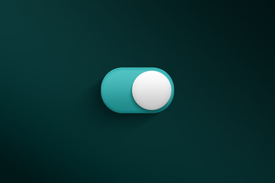
When it comes to button design, the choice of style and shape plays a pivotal role in user interaction. Buttons can take on various forms, from rectangular to circular, and even more complex shapes like rounded rectangles or pill-shaped designs. The shape of a button can convey different meanings; for instance, rounded buttons often feel more approachable and friendly, while sharp-edged buttons may appear more formal or professional.
Color is another critical aspect of button design. The color scheme should align with the overall branding of the website while also considering psychological implications. For example, blue is often associated with trust and security, making it a popular choice for call-to-action buttons in financial services.
In contrast, red can evoke urgency or excitement, which is why it is frequently used for sale promotions or alerts. In addition to shape and color, typography also plays a significant role in button design. The font used on a button should be legible and consistent with the website’s overall typography.
A bold font can draw attention to a primary action button, while a lighter font may be suitable for secondary actions. Furthermore, ensuring adequate contrast between the text and background color is essential for readability.
Adding Hover and Active States to Buttons
To enhance user experience further, incorporating hover and active states into button design is crucial. These states provide visual feedback to users when they interact with buttons, indicating that their actions are recognized by the interface. A hover state typically changes the appearance of a button when a user hovers their cursor over it, while an active state reflects the moment when the button is clicked.
Implementing hover effects can be achieved through CSS pseudo-classes such as `:hover` and `:active`. For example: “`css
.button:hover {
background-color: #45a049; /* Darker green */
} .button:active {
background-color: #3e8e41; /* Even darker green */
}
“` In this example, when a user hovers over the button, its background color changes to a darker shade of green, providing immediate visual feedback. Similarly, when the button is clicked (active state), it changes to an even darker shade, reinforcing the action taken by the user.
These interactive states not only improve usability but also contribute to the overall aesthetic appeal of the website. By carefully designing hover and active states, developers can create buttons that feel responsive and engaging, encouraging users to interact more frequently.
Using CSS to Create Button Animations
Animations can elevate button design by adding an extra layer of interactivity and engagement. CSS provides various techniques for animating buttons, allowing designers to create smooth transitions that enhance user experience. Simple animations can include changes in color, size, or position when users hover over or click on a button.
For instance, using CSS transitions can create a smooth effect when changing properties like background color or scale: “`css
.button {
transition: background-color 0.3s ease, transform 0.2s ease;
} .button:hover {
background-color: #45a049; /* Darker green */
transform: scale(1.05); /* Slightly enlarge */
}
“` In this example, when users hover over the button, it not only changes color but also scales up slightly, creating an engaging effect that draws attention. This subtle animation can make buttons feel more dynamic and responsive. More complex animations can be achieved using keyframes in CSS.
For example: “`css
@keyframes pulse {
0% { transform: scale(1); }
50% { transform: scale(1.1); }
100% { transform: scale(1); }
} .button:hover {
animation: pulse 1s infinite; /* Pulsing effect on hover */
}
“` This code snippet creates a pulsing effect when users hover over the button, making it stand out even more. Such animations not only enhance visual appeal but also guide users’ attention toward important actions on the page.
Designing Responsive Buttons for Different Devices
Introduction to Responsive Design
Responsive design involves creating buttons that adapt their size and layout based on the device being used—whether it’s a desktop computer, tablet, or smartphone. Using relative units such as percentages or viewport units (vw/vh) instead of fixed pixel values allows buttons to resize dynamically.
For instance, the following CSS code demonstrates how to create a responsive button:
“`css
.button {
width: 50%; /* Button takes up half the width of its container */
padding: 10px; /* Padding remains consistent */
}
“`
Responsive Button Styling
This approach ensures that buttons maintain their proportions regardless of screen size. Additionally, media queries can be employed to adjust styles based on specific breakpoints.
“`css
@media (max-width: 600px) {
.button {
font-size: 14px; /* Smaller font size on mobile devices */
padding: 8px; /* Reduced padding */
}
}
“`
Implementing Media Queries
By implementing media queries, designers can tailor button styles for different devices, ensuring optimal usability and aesthetics across platforms.
Best Practices for Responsive Buttons
Tips for Improving Button Accessibility and Usability
Accessibility is a fundamental aspect of web design that should never be overlooked. Buttons must be designed with all users in mind, including those with disabilities who may rely on assistive technologies such as screen readers or keyboard navigation. To improve accessibility, several best practices should be followed.
First and foremost, ensure that all buttons have descriptive text that clearly indicates their purpose. Avoid vague labels like “Click Here” in favor of more informative options such as “Submit Form” or “Download Report.” This clarity helps all users understand what action will occur when they interact with the button. Additionally, consider color contrast when designing buttons.
The text color should stand out against the background color to ensure readability for users with visual impairments. Tools like the WebAIM Contrast Checker can help assess whether your color choices meet accessibility standards. Keyboard navigation is another critical consideration.
Ensure that buttons are focusable and can be activated using keyboard shortcuts (e.g., Enter or Space). This allows users who cannot use a mouse to navigate your site effectively. Lastly, providing visual cues such as focus outlines or changes in appearance when buttons are focused can enhance usability for keyboard users.
Best Practices for Button Design with HTML and CSS
To create effective buttons using HTML and CSS, adhering to best practices is essential. First and foremost, maintain consistency in button styles throughout your website or application. Consistent colors, shapes, and typography help users recognize interactive elements quickly.
Another best practice is to prioritize simplicity in design. Avoid cluttering buttons with excessive text or complex graphics that may distract users from their primary function. A clean design enhances clarity and encourages interaction.
Furthermore, consider implementing clear call-to-action (CTA) strategies within your button design. Use action-oriented language that prompts users to take specific actions—words like “Get Started,” “Learn More,” or “Join Now” can motivate users to engage further with your content. Lastly, always test your buttons across different devices and browsers to ensure they function correctly and maintain their intended appearance.
User testing can provide valuable insights into how real users interact with your buttons and highlight areas for improvement. By following these best practices and leveraging the capabilities of HTML and CSS effectively, designers can create buttons that not only look great but also enhance user experience across various platforms and devices.
If you’re interested in exploring the dynamics of complex systems, you may want to check out the article on Understanding Bifurcations: Exploring the Dynamics of Complex Systems. This article delves into the intricacies of how systems can bifurcate and change behavior, offering valuable insights into the world of complexity theory. It’s a fascinating read that complements the technical aspects of designing buttons with HTML and CSS.
FAQs
What are the benefits of designing buttons with HTML and CSS?
Designing buttons with HTML and CSS allows for greater customization and control over the appearance and behavior of the buttons on a website. It also helps to improve the overall user experience and can make the website more visually appealing.
What are some common techniques for designing buttons with HTML and CSS?
Some common techniques for designing buttons with HTML and CSS include using CSS to style the button’s appearance, adding hover effects to create interactive buttons, and using CSS transitions and animations to add visual interest.
How can I create a responsive button design with HTML and CSS?
To create a responsive button design with HTML and CSS, you can use media queries to adjust the button’s appearance based on the screen size. You can also use flexible units like percentages or ems to ensure that the button scales appropriately on different devices.
What are some best practices for designing buttons with HTML and CSS?
Some best practices for designing buttons with HTML and CSS include using clear and concise text on the buttons, ensuring that the buttons are easily clickable and accessible, and testing the buttons across different browsers and devices to ensure consistent appearance and functionality.
Can I use CSS frameworks to design buttons?
Yes, CSS frameworks like Bootstrap and Foundation provide pre-styled button components that can be easily customized to fit the design of a website. These frameworks can help to streamline the button design process and ensure a consistent look and feel across the site.


+ There are no comments
Add yours